Chalfont Family Font
About this font
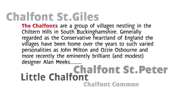
The typeface was designed after seeing a photocopy of some News Gothic text where the ink had faded on the bottom of each character. As character recognition is generally based on the top half of a character, readability was never compromised. Rather like Antique Olive the characters have a top heavy look when viewed straight on, however, as most type is read at an angle with the top further away than the bottom this top heavy look is diminished.
Get instant access to 9.5 million+ beautiful fonts & graphics
- ✔ Sign up for FREE and get access to all resources
- ✔ Get your first 10 downloads for FREE
- ✔ Commercial use allowed on all resources